Description of project: For our Introduction to Industrial Engineering course, our team completed a data visualization project. We selected a data set that included information on individuals’ ages, depression scores, stress levels, and average hours of sleep. Using this data, we created a variety of visualizations to explore and present key trends and relationships. Specifically, we produced a scatter plot, histogram, bar chart, and time series plot. These visualizations helped highlight potential patterns between age, mental health indicators, and sleep habits.
Description of data set: The data set we selected contains detailed information about individuals’ demographics, mental health, and lifestyle habits. It includes variables such as age, gender, education level, sleep hours, physical activity, social support, anxiety scores, depression scores, stress levels, and life satisfaction. Additional factors like family history of mental illness, substance use, therapy and meditation practices, financial and work-related stress, self-esteem, loneliness, and employment status are also recorded. This comprehensive dataset allowed us to explore relationships between age, mental health indicators, and sleep patterns through various visualizations.
When creating the time series chart, we looked at answering the question, do stress levels increase as people get older? In order to answer this question, we needed two sets of data from the data set. First were the ages of all the individuals and the stress levels correlated with them. Once we had both columns of data, we created a pivot table to make the charts. We binned certain ages together because the variety of ages was very large and it would have made the line look to hectic. After we binned the ages together, we saw that there wasn’t a drastic change of stress at first. We made another time series chart lowering the scale and we made the discovery that there is a slight increase of stress between the ages of 30 and 45. 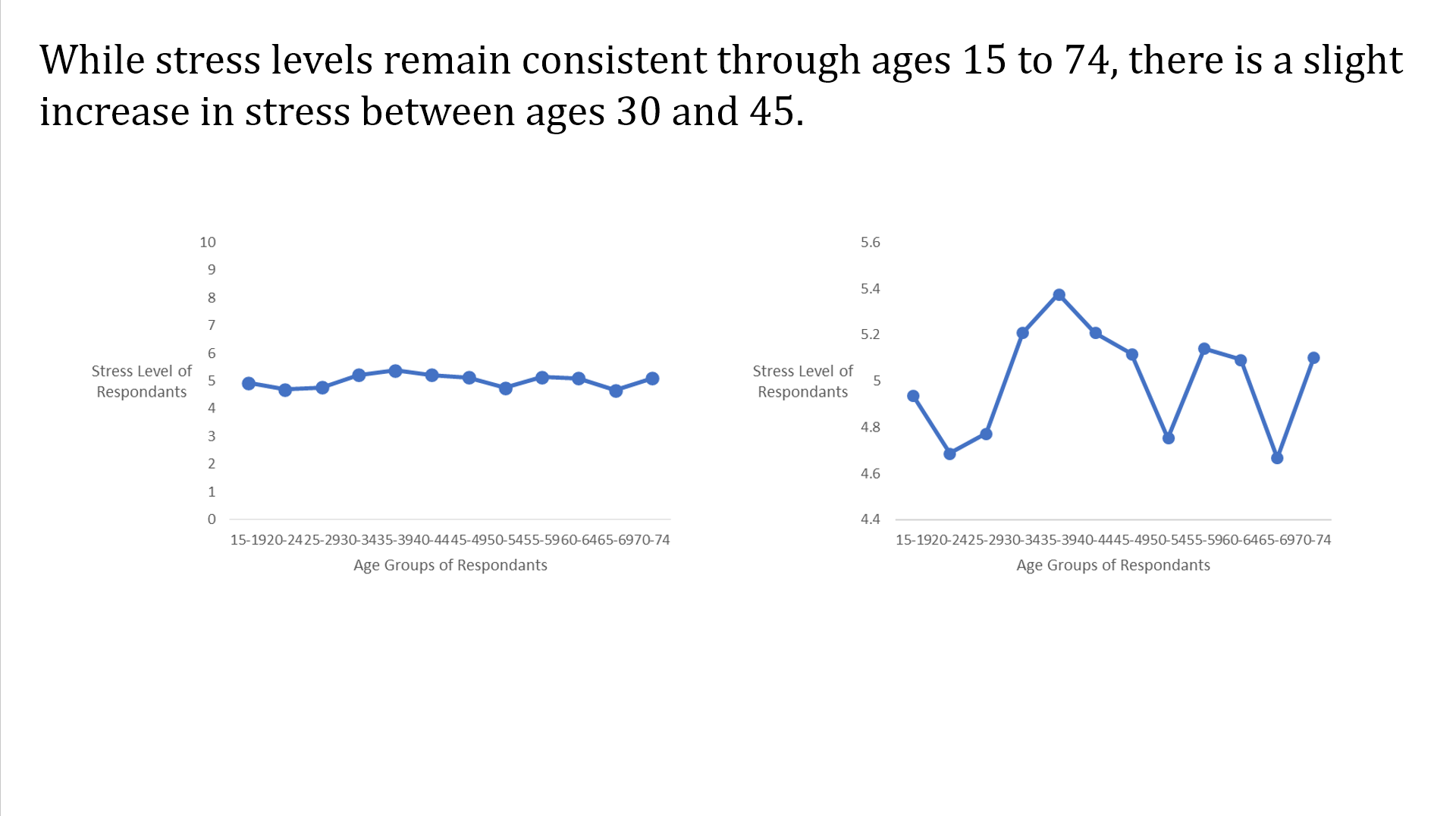
For the bar/column chart, we looked at answering the question, Is employment a good predictor of life satisfaction? In order to solve this problem and create our bar chart we gathered all factors of employment from the individuals. There were retired, unemployed, employed, and student statues available for all the people involved. We also grabbed the data from the life satisfaction column. We didn’t need to make a pivot for this chart but we did have to find the average of life satisfaction of each employment status. After making the bar chart we came to the conclusion that employment status is a moderate predictor since there wasn’t much vriation and other factors could play a bigger factor in satisfcation rating. 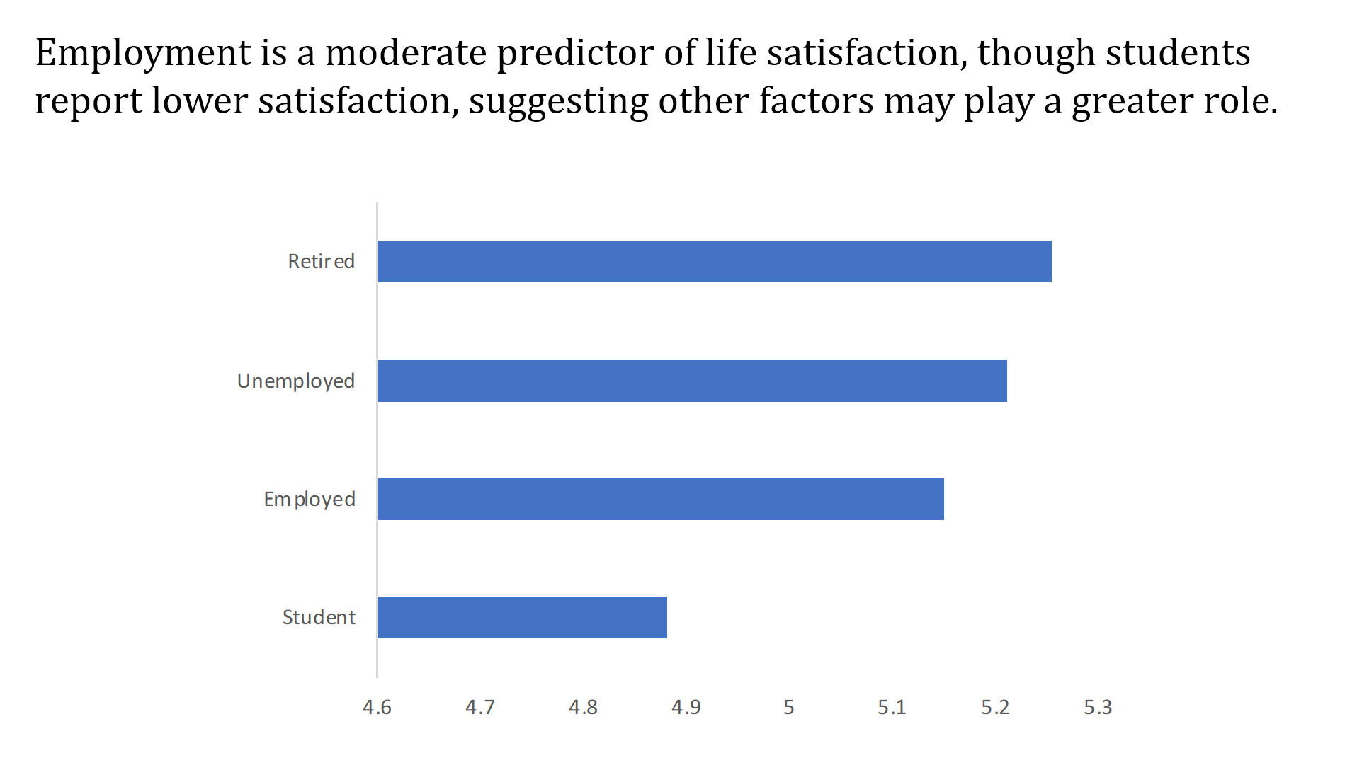
When it came to creating our scatter plot, we had to answer a question that involved two sets of numerical data. For this visualization we looked at the question, what is the relationship between depression score and physical activity? We chose both these factors since they have relevance to each other in the real world. To make this plot, we had to grab both sleep data and depression scores from all the individuals. Unlike the last graph, we had to make a pivot table in order to get the count of depression scores related to physical activity.After we made the scatter we came to the conclusion that there doesn’t seem to be a huge correlation between depression score and physical activity. This also makes sense because there could be other factors affecting depression score. 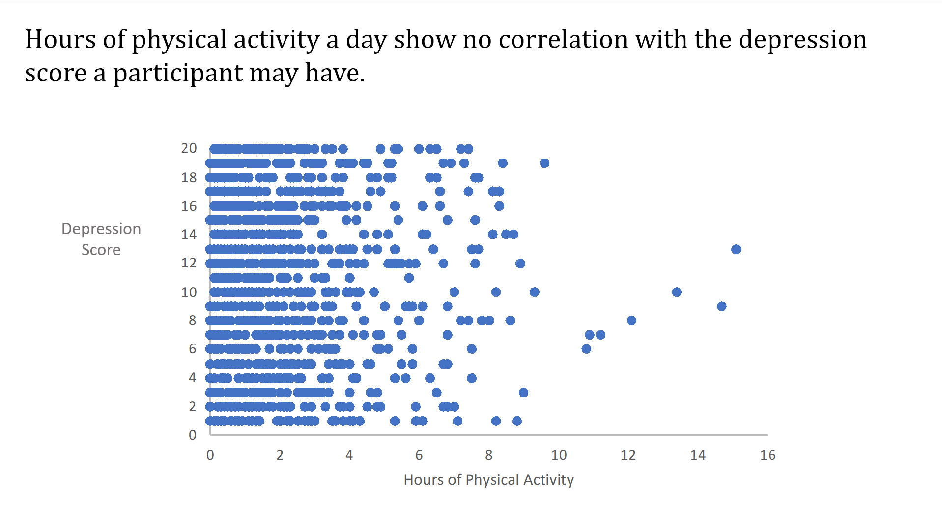
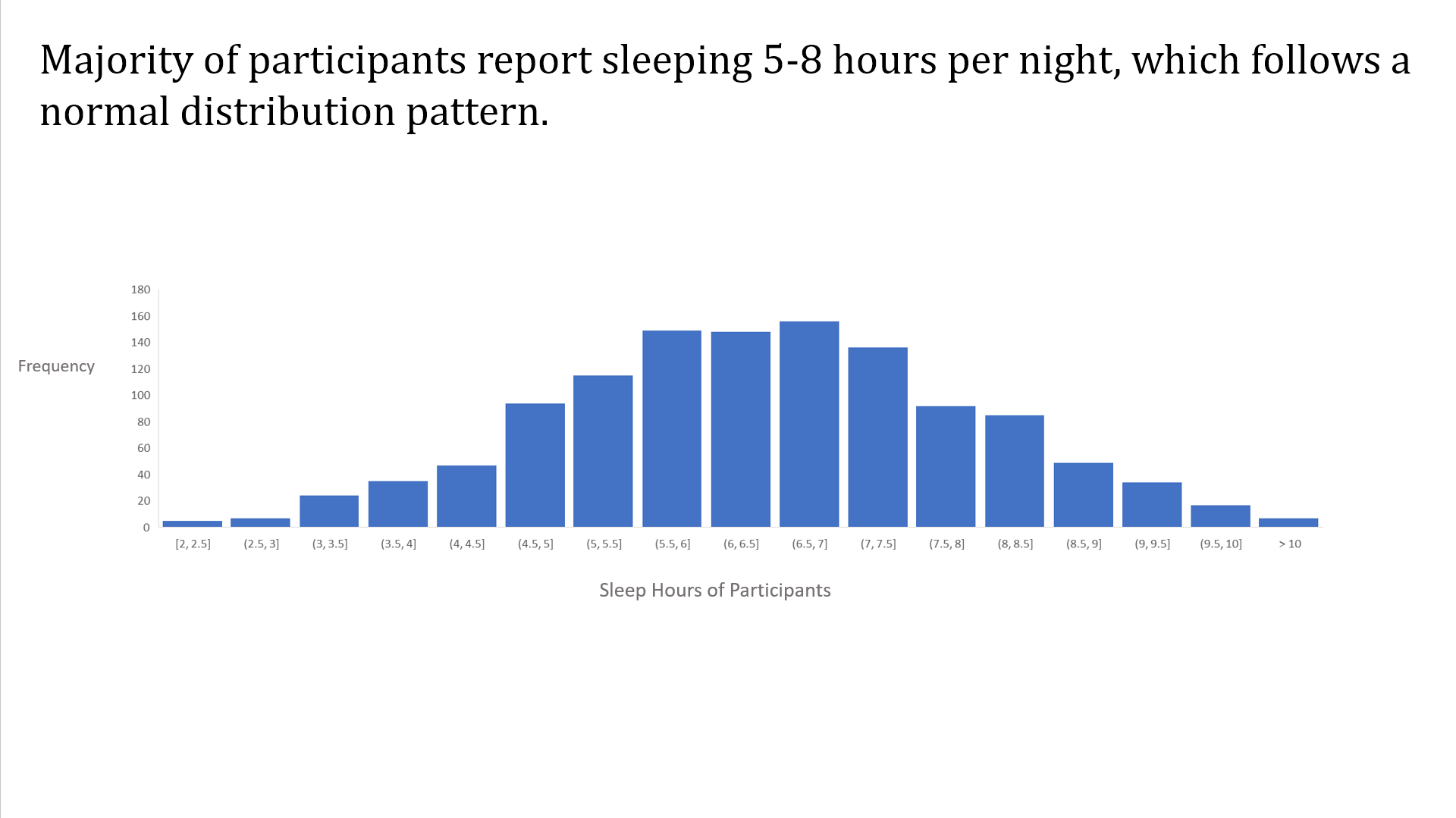
For our histogram, we looked at the statistical distribution of sleep hours per day. In order to make this chart, we only needed the sleep data from the participants. Once we had the data, we made the graph without a pivot table involved. Once we had the data as a statistical distribution, we saw that the majority of participants reported sleeping five to eight hours per day. The histogram showed this as a normal distribution pattern.